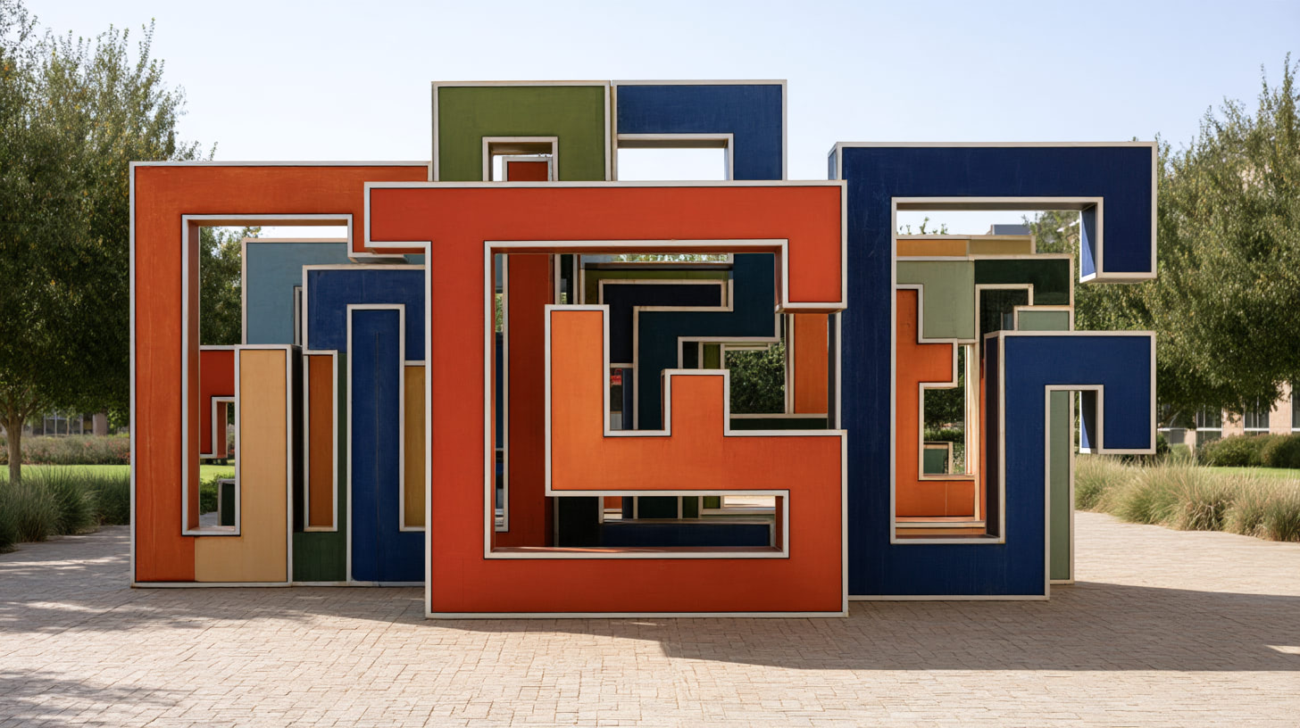
Designers at the Geneva studio of the international agency cheeeeese worked with The Geneva Learning Foundation to turn its logo into a symbol of the foundation’s problem-solving and peer learning pedagogy
For its tenth anniversary, The Geneva Learning Foundation retired the serif wordmark that helped establish it. Over a series of video calls that began in May 2026, the foundation and designers from cheeeeese tested three ideas and chose one: a key from Geneva’s coat of arms, given to the health worker looking for the root cause of a problem.
Read the press release: Agency cheeeeese creates a new logo for The Geneva Learning Foundation’s tenth anniversary
Learn more: Design review: The Geneva Learning Foundation’s new logo
A creative director spots what the old logo hides
On an introductory video call with TGLF in May 2026, Cédric Delmont scrolled through his studio’s recent work.
He showed a modular sales kit for Nespresso, wrapped in water-resistant moleskin because the old binders kept getting soaked on café counters, a magazine for Lancôme’s eightieth birthday, a limited edition for Diwali, and packaging for Valentino.
Then he opened the website of The Geneva Learning Foundation (TGLF) and looked at its logo.
“It is very literal,” he said, diplomatically. “You do not feel the action. It feels statutory. For me, there is an enormous lack of action compared with what you are telling me.”
The foundation agreed, and explained what the logo had been built to do.
Read the full design review:
Trajan establishes the foundation, then the work moves on
The old wordmark was set in Trajan, a capital-only serif used by a number of philanthropic organisations.
When TGLF started, it needed to establish itself as an institution that partners, funders, and health ministries would take seriously.
Trajan was right for that time and served the foundation for a decade.
By 2026, TGLF needed the logo to show its work.
At that first meeting, TGLF described the anniversary this way: “Since it is our tenth anniversary, in a sense, everything is permitted. We are not a hundred years old. And the idea is also perpetual renewal. Since we work on change, it would be strange…”
Switzerland has an estimated 15,000 foundations, and most have no operations.
By nature, TGLF is hyperactive. TGLF’s global team researches, develops, and runs programmes with a network that counts, as of October 2026, over 80,000 health and humanitarian practitioners, supported by some 400 alumni ambassadors who recruit colleagues in their own workplaces.
TGLF’s founder, Reda Sadki, sometimes called TGLF “a bit of a Trojan horse,” because it looked like one kind of institution and behaved like another.
“We are all about action, learning by doing,” he said. “Our old logo did not communicate this at all. My worst nightmare is that we get mistaken for a think tank.”
TGLF explained its model with an example.
When a health worker in Nigeria knows that children in her area are missing their vaccinations, “we are not going to tell [her] what [she] must do. We consider that she knows better than we do.”
TGLF provides her with new tools to find the root causes and a network to ask peers who have faced the same problem, leading change with the resources she already has.
A luxury studio takes on a learning network
The cheeeeese studio was founded in Paris in 2000 and takes its motto from Stendhal: “Beauty is the promise of happiness.” It works mostly for beauty and premium brands, with offices in Paris, Madrid, Geneva, Rio de Janeiro, and São Paulo, and clients including L’Oréal, LVMH, Unilever, and Lindt. Under its registered “design en direct” method, clients work with the designers themselves, with no account managers in between.
One of its seven agencies, CALL112, specialises in health communication, and the Geneva studio led a raw meat food safety campaign for the Republic and Canton of Geneva that ran on the city’s buses.
The Geneva studio took on the TGLF identity pro bono.
Delmont graduated in art direction and graphic design from Condé in Toulouse in 2007 and worked in Lyon before joining cheeeeese in Geneva in 2011.
He became creative director in 2017 and country manager for Switzerland in 2020.
In one season, he said, the studio might design for a mayonnaise brand and for watches that cost 40,000 francs.
“Every brand has its own problems,” he said, and the work is to understand a new sector and find how to stand out.
Even when a brand has fixed codes, “there is still room to bring creativity. Within the frame, you find your way through.”
Two designers carried the work: Manon Laridan and Lea Pérez.
Pérez is a senior graphic designer who spent more than eleven years with cheeeeese in Madrid before moving to Geneva in 2021.
The designers build for a foundation with an agentic AI communication team
TGLF’s web tools were basic, and email remained “the common denominator” for health professionals across Africa, Asia, and Latin America.
“You could make us something magnificent,” TGLF warned. “The visual identity we dream of. Then the difficulty is how we use it in practice.”
Delmont designed for that limit.
He promised social media templates, simple rules, and open source typefaces.
There is one additional twist: TGLF transitioned its communication team to agentic AI this year.
An artificial intelligence will be the one managing the identity, with human oversight, once the studio delivers it.
The studio shows three routes, and the key wins
On 10 June 2026, after weeks of creative work, the designers presented three routes.
Manon Laridan led the presentation, and Delmont explained the reasoning.
The first route kept the old icon, a small rectangle that could read as a window, a door, or a book, and set the name in lowercase.
For Delmont, this route answered the distance he had seen in the old logo: “This was about breaking all that to bring closeness.” He described the icon as “a sort of bridge, an open window, a door that opens to come and help you.”
Blue stood for learning, green for impact in the field, and red for community.
TGLF liked the lowercase but thought the blue and white looked like a semaphore flag.
The third route set the full name beside a vertical cursor, the bar that blinks in a text editor.
Laridan described it as a spine.
Delmont said the line could also read as “a connection between problems.” TGLF linked it to scaffolding, the term education researchers use for temporary support that helps a learner reach the next level, but worried that a thin line beside a block of text would look like “just a line someone stuck on the side.”
The second route built the letters T, G, L, and F on a grid of pixels, which Laridan said echoes digital learning.
One letter becomes a key.
“This key echoes the emblem of Geneva, which has a key on it,” she said.
“It reinforces the local anchoring and the identity.”
She added that the key also stands for the solution to a problem.
The palette dropped to two colours, red and blue-grey.
Before responding, TGLF asked the designers which client they dreaded more: “The client who says all three are awful, or the one who says he wants to keep all three?” Laridan replied, “We are happy if you like all three routes, because these are three routes we care about.”
TGLF chose the key.
“I love the labyrinth key,” Sadki said, “and the idea of the key to solutions, and how to get out of the labyrinth of problems, the local challenges that health and humanitarian workers face.”
Later in the call, he returned to the same route: “My eye keeps coming back to the middle one, with the labyrinth, the way out of the labyrinth.”
Geneva’s key moves into the health worker’s hand
On Geneva’s shield, the key belongs to Saint Peter and stood for the prince-bishops who once ruled the city and held the power to open and to close.
In the TGLF mark, the key sits inside a maze, at the way out.
A health worker facing a complex local problem, such as children missing their vaccinations or a rural health centre that medicines cannot reach, has to find the root cause before finding the solution.
TGLF reads the key as that root cause.
Peers in the network, who have faced the same problem elsewhere, help each other find it.
The foundation’s doubts reshape the name
When TGLF first saw the key route, it worried that strangers would see “a sort of muddle, deformed letters” and miss the name.
The designers answered by setting the name beside the mark on four short lines: The, Geneva, Learning, Foundation.
Newcomers can now read the name at a glance.
TGLF is still deciding whether to be known by its initials, as Médecins Sans Frontières became MSF.
Part of the reason is the word learning, which for many people “stays in a classroom, with a teacher giving a speech,” the opposite of how the network works.
The stacked wordmark and the four-letter mark can carry either name.
The type keeps the promise Delmont made in May: Space Mono, Source Code Pro, and Montserrat are all free and open source.
Health workers’ words take over the templates
The social media templates in the presentation give most of the space to health workers.
One card quotes Dr Khalid Hassain Memon, a public health specialist in Sindh Province, Pakistan: “On the 29th day, the District Health Officer arranged a tractor trolley with the support of a local landlord of a nearby town 15 km away from the affected town, filled it with essential medicines, and we succeeded to reach the rural health centre of the affected town.” Another quotes Ngontcha Basile, a community health worker in the Cité Verte health district of Yaoundé, Cameroon, who approached the district chief and the mayor to set up two shaded spaces against the heat, then scheduled health education sessions “in the late afternoon, when the heat is easing slightly.”
On these cards the mark sits small in a corner and the quotation fills the frame.
In Sindh Province, it took 29 days and a borrowed tractor trolley to get medicines to the rural health centre.
The key in the corner of the new templates stands for the moment someone works out how.
The Geneva Learning Foundation’s tenth-anniversary identity was designed by Manon Laridan and Lea Pérez of the Geneva studio of cheeeeese, under the creative direction of Cédric Delmont.
[…] Read our magazine feature article: When Swiss cheese is good for health: the surprising story of The Geneva Learning Foundation’s new… […]
[…] Lire notre article: Quand le fromage suisse est bon pour la santé: l’histoire surprenante du nouveau logo de la Fonda… […]