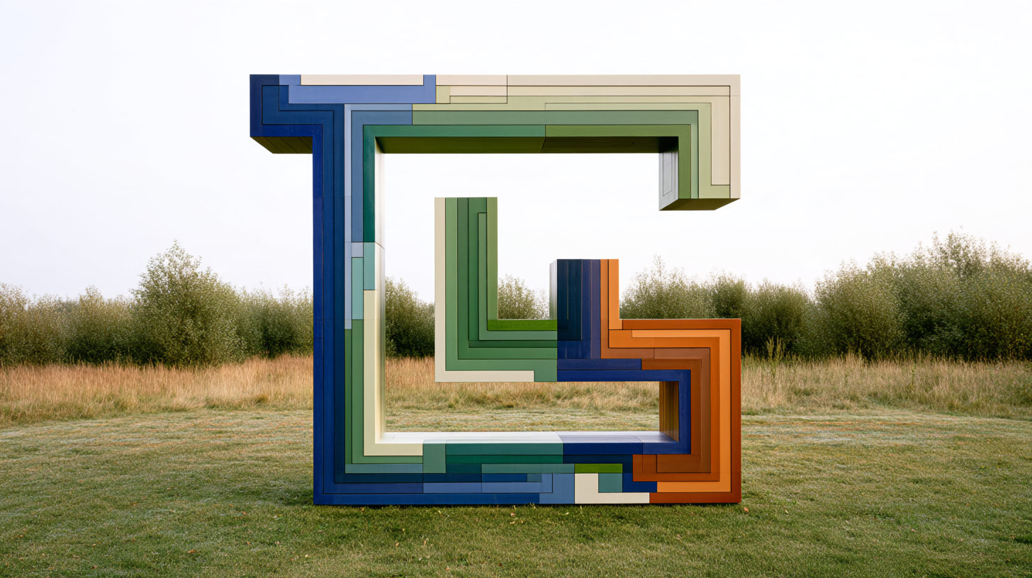
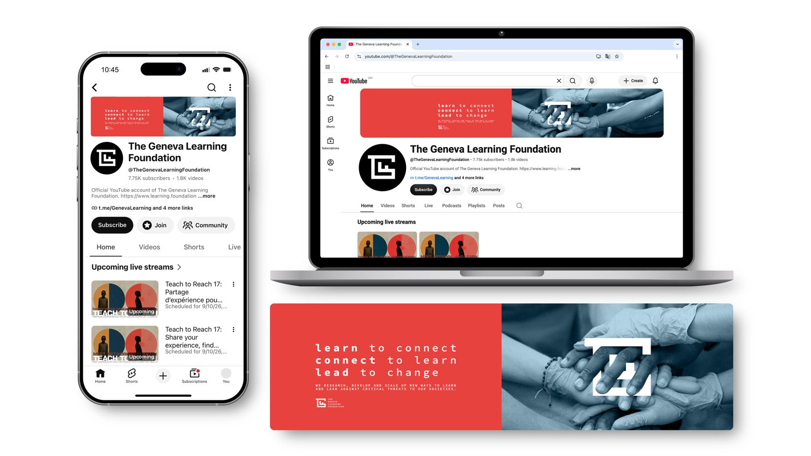
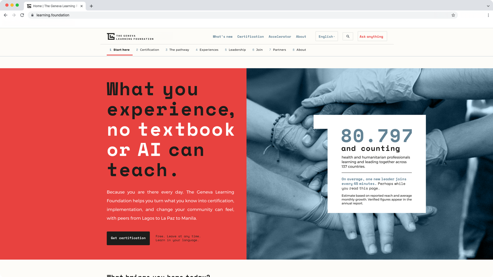
The Geneva Learning Foundation’s new mark shows how we work: connect with peers, find the key to a local problem, and get out of the maze. This is the design review.
Read the press release: Agency cheeeeese creates a new logo for The Geneva Learning Foundation’s tenth anniversary
Read our magazine feature article: When Swiss cheese is good for health: the surprising story of The Geneva Learning Foundation’s new logo
TGLF retires its old serif and its inaugural painting
Foundations often set their names in an inscriptional serif in spaced capitals. The type signals endowment and permanence and tells partners that a new institution can be trusted. The Geneva Learning Foundation (TGLF) used Trajan, a typeface shared with other philanthropic organisations, for its first ten years. The wordmark, set against “Dinosaur”, a 2016 painting by the young artist Muhammed El-Haroun, established the foundation.
For its second decade, TGLF needed an identity that shows its work. The foundation works with a growing network of more than 80,000 health and humanitarian practitioners who solve local problems with local resources and learn from each other as peers. The pro bono identity by the Geneva studio of the international design firm cheeeeese puts that method into the drawing of the mark.
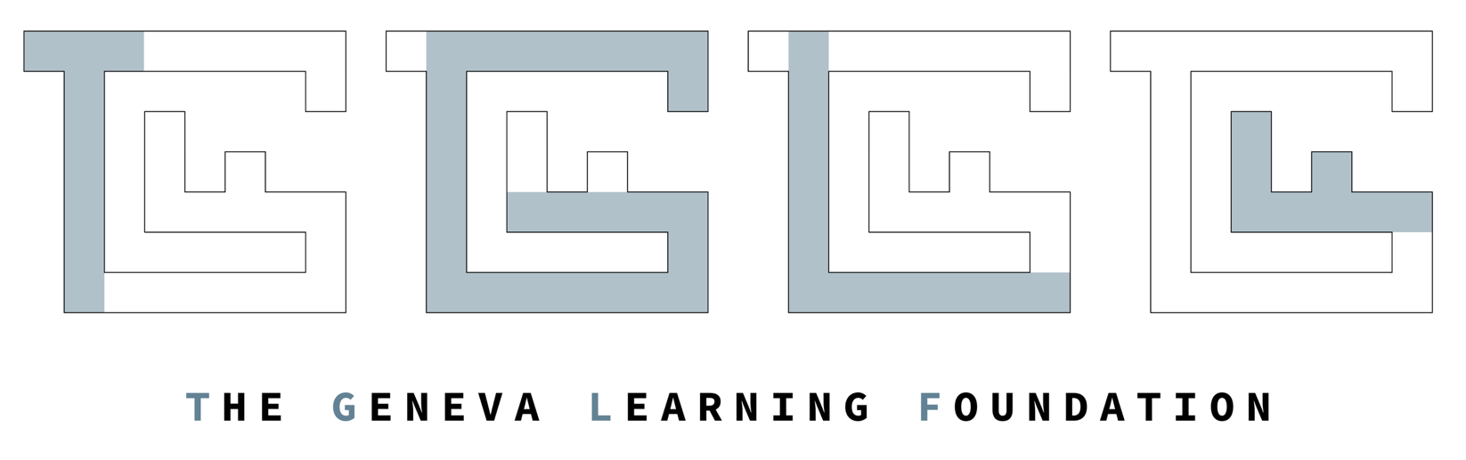
Four letters build one connected path
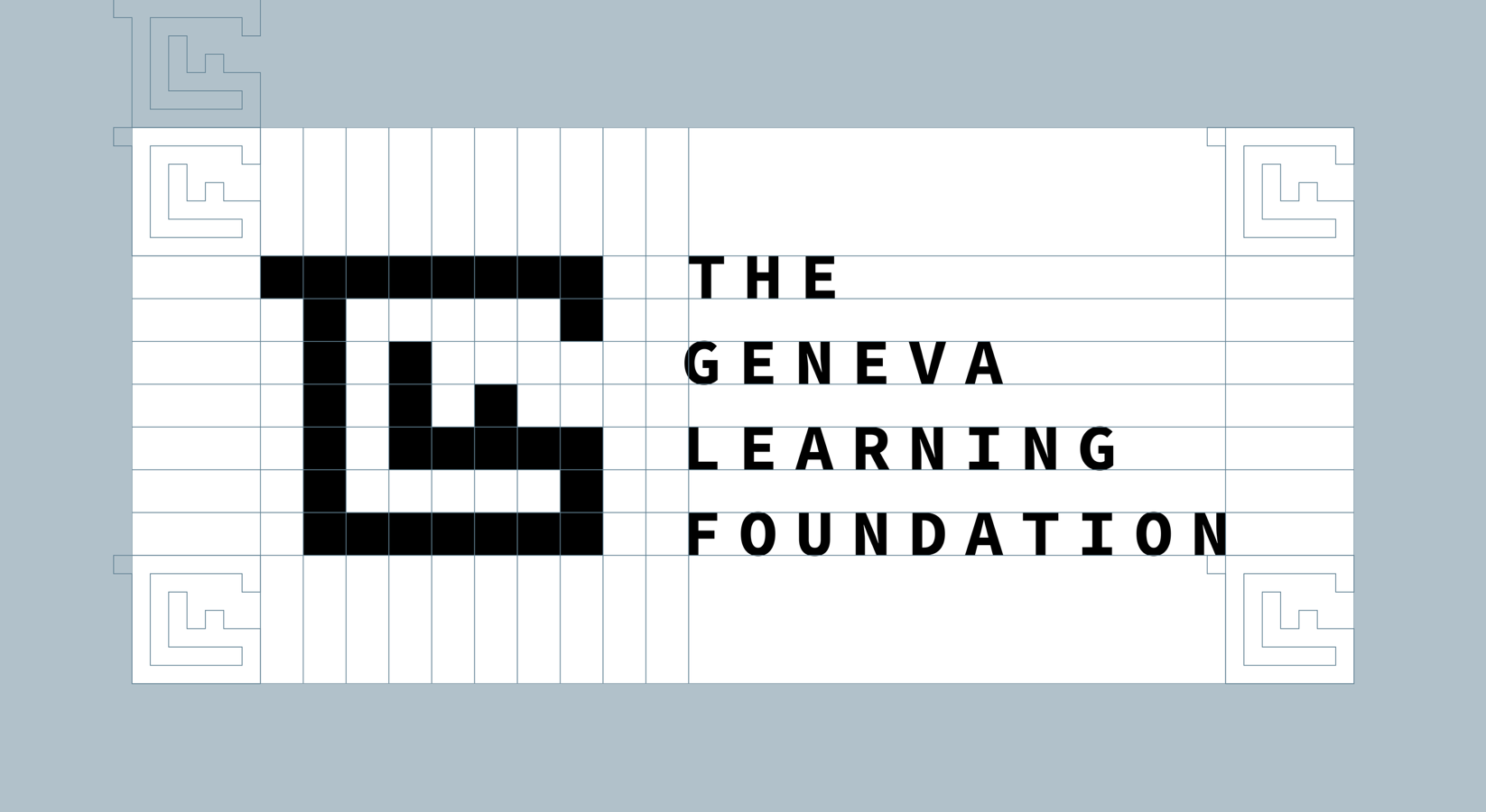
The mark uses a single stroke weight on an orthogonal grid, with no curves, no diagonals, and square terminals. The studio describes it as constructed from a system of pixels. A construction slide in the presentation separates the four letters, T, G, L, and F, before they lock together.
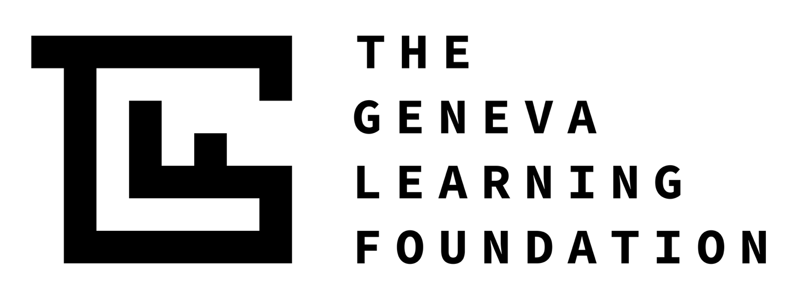
In the finished mark, a bar overhangs the top left corner as the crossbar of the T, and its stem drops into an outer wall that runs along the bottom and up the right side. An inner vertical and a horizontal bar with a single raised tooth sit inside the enclosure. Every stroke touches another, so the four letters form one connected path.
The connected path matches how TGLF works. No letter stands alone, and each one depends on the next to close the shape. In a peer learning network, a health worker in one district solves a problem by asking colleagues who have faced the same problem in another. The foundation’s line, which runs across the presentation layouts, says it in words: “learn to connect, connect to learn, lead to change.”
The key sits at the way out
Closed up, the letters form a small labyrinth with one opening on the right-hand side. The horizontal bar with its tooth reads as the bit and shaft of a key, and it runs to the right wall just below that opening.
TGLF asks health workers to find the root cause of a problem, such as why children in one area miss their vaccinations, before they design a solution. The key in the mark stands for that root cause. Once you find it, you can get out of the maze.
The mark works at two levels. A viewer who reads only the letters sees TGLF. A viewer who reads the shape sees a problem, a key, and an exit.
Geneva lends its key to the mark
The key comes from the shield of Geneva, which places half of the black imperial eagle beside a gold key on red, above the Reformation motto Post Tenebras Lux, “after darkness, light.” The key of Saint Peter stood for the prince-bishops who once ruled the city and held the power to open and to close. Geneva still uses it on flags, public buildings, and the Geneva Seal stamped on watch movements.
Place-based identities often crop a flag or outline a landmark. cheeeeese kept the heraldic object and changed what it does. In the shield, the key belongs to whoever governs. In the TGLF mark, it belongs to the person inside the problem who is looking for the way out. The studio used the key to anchor the foundation in its home city and left out the eagle, the gold, the motto, and any lake. Only the red stays, and it carries into the palette.
Monospace gives every letter the same cell
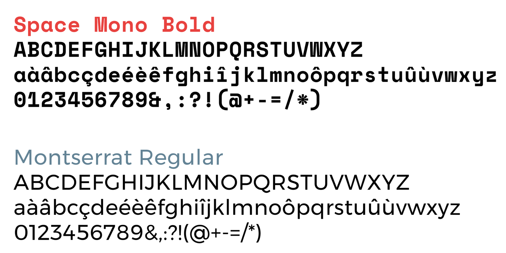
The presentation sets its type in Space Mono, the monospaced family Colophon Foundry drew for Google Fonts in 2016, with Source Code Pro and the geometric sans-serif Montserrat. All three are free and open source. Monospace belongs to the typewriter, the terminal, and the code editor, the tools of people writing drafts and building things. In a sector that uses serifs to signal endowment, TGLF now uses a typeface designed for writing code.
In a monospaced face, the narrow “i” and the broad “m” get the same width. In TGLF’s network, a community health worker and a public health specialist contribute on the same terms. The grid of the type matches the pixel grid of the mark.
The stacked name restores legibility
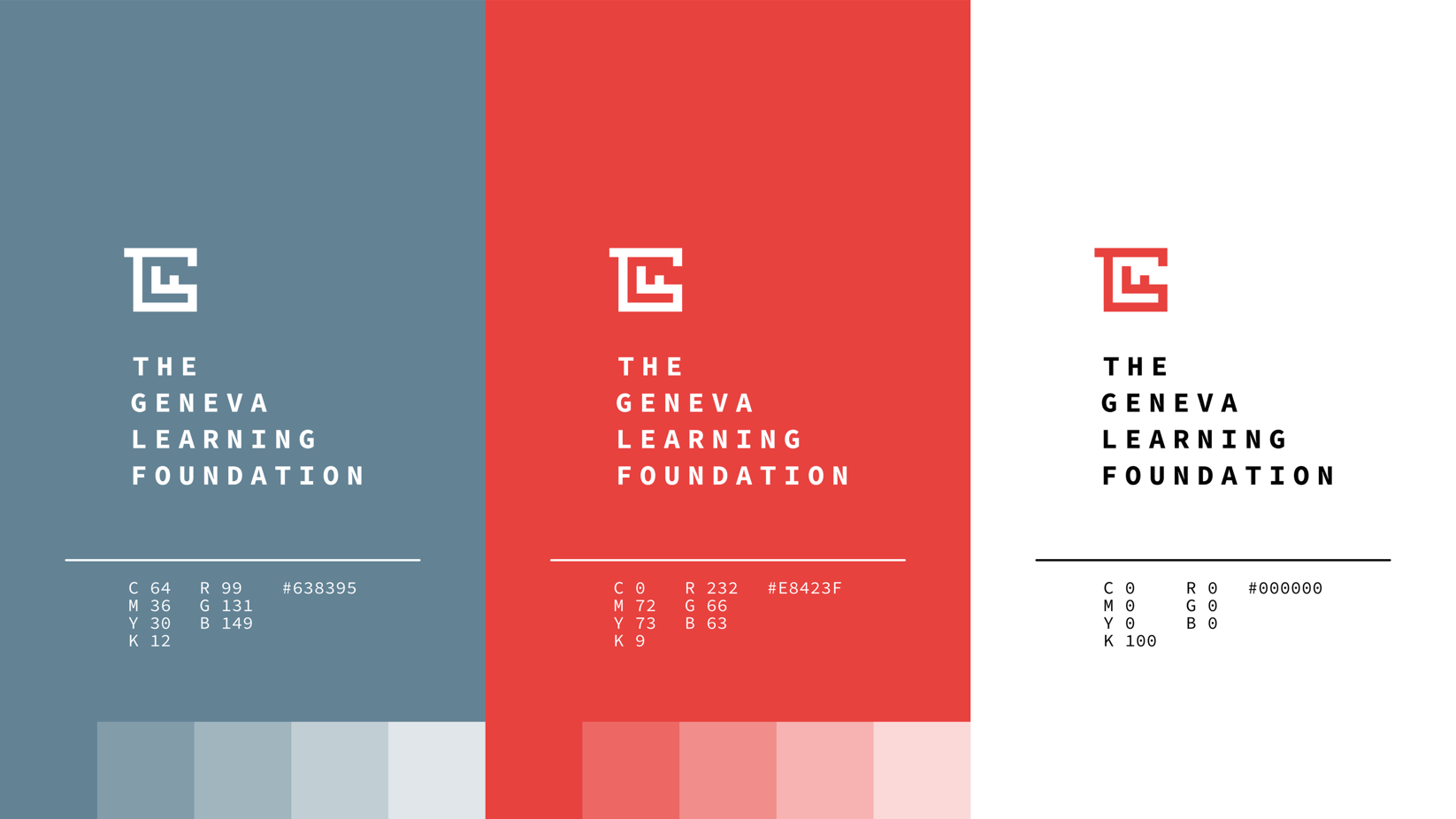
A mark built from interlocked letters carries a risk: strangers may see only deformed letters and miss the name. The final lockup stacks the wordmark on four short lines, beside or below the mark. The long name becomes a compact rectangle that echoes the square mark.
Each line isolates one word, so Geneva and Learning read as separate ideas. Short lines also absorb translation into French, Spanish, Portuguese, Ukrainian, and Arabic, languages TGLF already works in. The presentation shows horizontal, stacked, and framed versions, so the mark can sit in a row of partner logos or anchor a full page.
The palette saves red for emphasis
The colours are a signal red, slate and blue-greys, a deep navy, and a warm off-white in place of pure white. The studio assigned red to engagement, collaboration, and impact, and blue-grey to expertise, reliability, and the transmission of knowledge.
The greys and navy carry most layouts and stay legible on low-quality screens. Red appears as an accent or a block of colour. The off-white gives printed pieces warmth that bright white would not.
The templates hand the page to health workers
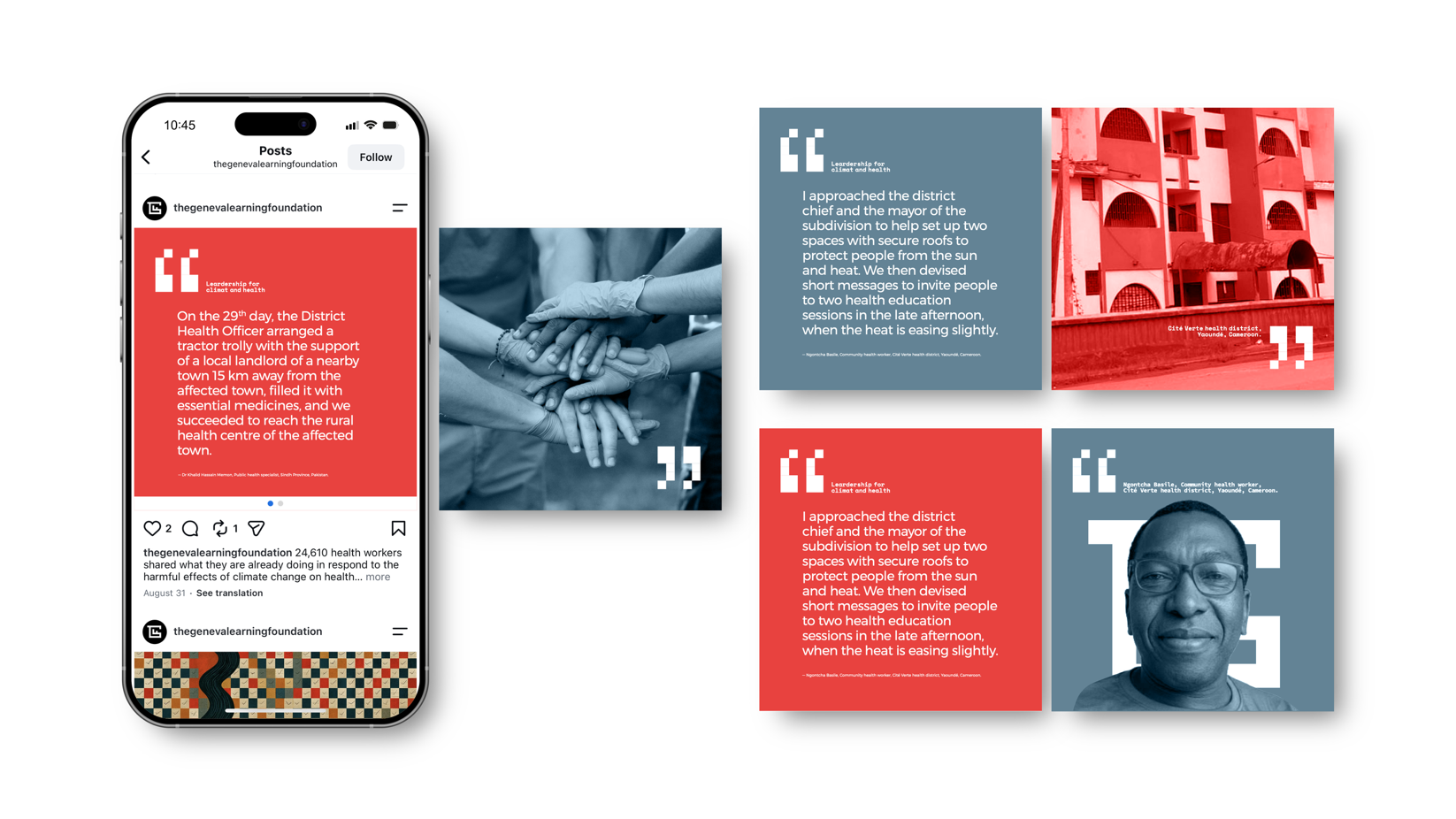
The social media templates give most of the frame to health workers’ own words. One sample card carries the account of Dr Khalid Hassain Memon, a public health specialist in Sindh Province, Pakistan, on getting medicines to a rural health centre. Another carries the account of Ngontcha Basile, a community health worker in Yaoundé, Cameroon, on protecting people from the heat.
The mark sits small in a corner, and the type is set plainly, like a document. The stories belong to the health workers, and the layout gives them the space.
[…] Learn more: Design review: The Geneva Learning Foundation’s new logo […]
[…] Learn more: Design review: The Geneva Learning Foundation’s new logo […]